Skip to content
Comics
» MARTIAN UNIVERSE
Martian Comics
Kimot Ren
Forever Man
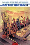
The Synthetics
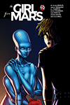
The Girl from Mars
Shizukesa
Martian Universe Archive (Old Stuff)
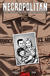
Necropolitan
The Tessellation
Other Comics
Books
Dance until Dismembered
My Voyage in Letters
American Galactic
Nagging Wives, Foolish Husbands
Dead Animals
Nira/Sussa
Watching People Burn
Magazine
Martian News
Fiction
Poetry
Non-Fiction
Video
Comics
Art
About Us
Masthead and Contact Info
Submission Guidelines
Martian Lit on Patreon
Martian Lit on IndyPlanet
Martian Lit on Twitter
Martian Lit on Facebook
Martian Lit Mailing List (free book for signing up!)
Log In
Create Free Account
Search for:
CONNECT WITH MARS
CURRENT COLLECTED EDITIONS
NEW & UNCOLLECTED ISSUES
COMING SOON
BOOKS BY JULIAN DARIUS
OTHER FICTION AND POETRY